


1. 텍스트 관련 인풋 타입
  <h1>텍스트 관련 인풋 타입</h1>

  <form action="#">
    <label for="txtIp">text</label> <br>
    <input
      id="txtIp"
      type="text"
      placeholder="5자 이하"
      maxlength="5"
    >

    <!--type은 따로 설정 안하면 "text"가 default 다.-->

    <br><br>

    <label for="pwdIp">password</label> <br>
    <input
      id="pwdIp"
      type="password"
      placeholder="4자 이상"
      minlength="4"
    >

    <!--type = "password"는 적은 글자 내용이 안 보이게 만들어주는 녀석이다.-->

    <br><br>

    <label for="srchIp">search</label> <br>
    <input id="srchIp" type="search">

    <!--search는 글을 적으면 옆에 자동으로 해당 bar를 클리어 시켜주는 x자 표시가 뜬다.
    	모바일에서 한다면, 옆에 돋보기 표시가 뜨게 하는 type 이다. -->

    <br><br>


    <label for="tlIp">tel</label> <br>
    <input id="tlIp" type="tel">

    <!--tel type은 모바일에서 눌렀을 시 자동으로 숫자 키패드가 뜨게 하는 타입이다.-->

    <br><br>

    <button type="submit">제출</button>
  </form>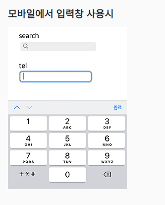
(1)텍스트 관련 인풋의 속성들
placeholder는 빈 칸에 보이는 안내문이다.
maxlength는 적을 수 있는 최대 길이다. 그 이상 적으면 자동으로 짤린다.
minlength는 적어야할 최소 길이다. 위반 시 submit이 거부된다.
2. 숫자 관련 인풋 타입
  <h1>숫자 관련 인풋 타입</h1>

  <form action="#">
    <label for="numIp">number</label> <br>
    <input
      id="numIp"
      type="number"
      min="0"
      max="10"
    >

    <!--type = "number"는 해당 칸에 숫자만 쓸 수 있도록 하는 것이다.-->

    <br><br>

    <label for="rgIp">range</label> <br>
    <input
      id="rgIp"
      type="range"
      min="0"
      max="100"
      step="20"
    >
    <!--type = "range"는 범위를 나타내는 스크롤 바를 생성하는 타입이다.(밑에 그림 참고) -->

    <br><br>

    <label for="dtIp">date</label> <br>
    <input
      id="dtIp"
      type="date"
      min="2020-01-01"
      max="2030-12-31"
    >

    <!--date는 년,월,일을 나타내는 타입이고, 달력 표시를 뜨게 한다.
    	datetime-local, month,time,week 등 다양한 바리에이션의 타입이 있다.(밑의 링크 참고) -->

    <br><br>

  </form>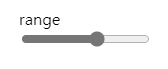
👉 date type's variation datetime-local, month, time, week
(1)숫자 관련 인풋 속성들
min, max: 해당 칸에 적을 수 있는 숫자 값의 최대, 최소를 나타냄. (date 등 타입에 따라 형식이 다를 수 있음.)
step: range 타입에서 한번에 갈 수 있는 간격을 뜻함.
(위에선 20으로 설정했음으로 0 > 20 > 40 > 60 > 80 > 100 으로 간다.)
3. 체크 관련 인풋 타입
 <h1>체크 관련 인풋 타입</h1>

 <!--특이점: 체크 관련 인풋들은 input 다음에 연결된 label이 나온다.-->

  <form action="#">
    <h2>checkbox</h2>
    <input
      id="cbIp"
      type="checkbox"
      checked
    >
    <label for="cbIp">유기농</label> <br>

	<!--check type은 레이블된 텍스트 옆에 체크 박스를 생성한다.
    	checked 되어 있으면 체크 된 채로 사용자에게 뜬다. 저 말 지우면 체크 안된 채로 뜬다.-->

    <h2>radio</h2>
    <input
      type="radio"
      name="fruit"
      id="f_apple"
      value="apple"
      checked
    >
    <label for="f_apple">사과</label>
    <input
      type="radio"
      name="fruit"
      id="f_grape"
      value="grape"
    >
    <label for="f_grape">포도</label>
    <input
      type="radio"
      name="fruit"
      id="f_orange"
      value="orange"
    >
    <label for="f_orange">오렌지</label>

    <!--radio type은 하나가 체크 되면 그룹 지어진 품목들은 자동으로 체크 해제 되도록 하는 type이다.
    	이는 radio 버튼이 하나 누르면 나머지가 튀어 올라오는 것에서 유래되었다.
        name 속성이 같은 것끼리 하나의 그룹으로 간주되어 서로 체크의 영향을 주고 받는다.-->

    <br>

    <input
      type="radio"
      name="vege"
      id="v_carrot"
      value="carrot"
      checked
    >
    <label for="v_carrot">당근</label>
    <input
      type="radio"
      name="vege"
      id="v_tomato"
      value="tomato"
    >
    <label for="v_tomato">토마토</label>
    <input
      type="radio"
      name="vege"
      id="v_eggplant"
      value="eggplant"
    >
    <label for="v_eggplant">가지</label>

  </form>
(1) 체크 관련 인풋 속성들
checked: 이게 input 내에 적혀있으면 해당 텍스트 옆 체크박스가 체크 된 채로 사용자에게 뜬다.
이걸 지우면, 체크가 안된 채로 사용자에게 뜬다.
name: radio type input들에서 각 input들을 그룹 짓는데 사용된다. name이 같은 것끼리 같은 그룹으로 묶이고, radio 효과
에 영향을 받는다. (A,B,C가 같은 name 값을 가졌다고 할 때, A를 체크하면, B,C 자동 해제 // B를 체크하면 A 자동
해제)
Value: 어떤 옵션이 체크 되었을 때, 실제로 백엔드에 보내지는 값이다. 따라서 텍스트는 사용자 친화적으로 적어주고,
value 값은 개발자 친화적으로 적어놔야 한다.
4. 기타 인풋 타입
  <h1>기타 인풋 타입</h1>

  <form action="#">
    <label for="fileIp">file</label> <br>
    <input
      id="fileIp"
      type="file"
      accept="image/png, image/jpeg"
      multiple
    >

    <!--file type은 localhost에서 있는 특정 파일을 웹으로 전송할 수 있도록 해주는 type 이다. -->

    <br><br>

    <label for="hdnIp">hidden</label> <br>
    <input
      id="hdnIp"
      type="hidden"
    >

    <!--hidden type은 사용자에게 알리고 싶진 않지만,
    	해당 페이지의 값들과 같이 전송되어야 하는 정보를 담는 타입이다.-->
  </form>

    <br><hr><br>

    <form action="#">
    <label for="emlIp">email</label> <br>
    <input
      id="emlIp"
      type="email"
    >

    <!--email type은 @이가 들어간 이메일 양식이 아니면 submit 못하게 하는 타입이다.-->

    <br><br>

    <button type="submit">제출</button>
  </form>
(1)파일 인풋 관련 속성들
accept: 받아들일 수 있는 파일 형식을 나타내주는 속성이다. 안 적으면 모든 파일 형식이 가능하다는 소리이다.
적는 형식으로는 accept = ".확장자" 또는 accept = "image/확장자"(뜻: 해당 확장자의 이미지 파일만) 등이 있다.
multiple: 해당 속성이 파일 type에 입력되어 있으면 여러 파일을 한번에 업로드 가능하다.
👉 작성 가이드5. 인풋 요소들의 공통적인 속성
  <h1>인풋 요소 공통(대부분) 속성</h1>

  <form action="#">
    <label for="valIp">value</label> <br>
    <input
      id="valIp"
      type="text"
      value="지정됨"
    >
    <br><br>

    <label for="afIp">autofocus</label> <br>
    <input
      id="afIp"
      type="text"
      placeholder="자동 포커스됨"
      autofocus
    >
    <br><br>

    <label for="roIp">readonly</label> <br>
    <input
      id="roIp"
      type="text"
      value="읽기만 가능, 전송됨"
      readonly
    >
    <br><br>

    <label for="rqIp">required</label> <br>
    <input
      id="rqIp"
      type="text"
      placeholder="필수입력!"
      required
    >
    <br><br>

    <label for="daIp">disabled</label> <br>
    <input
      id="daIp"
      type="text"
      placeholder="입력불가, 전송 안됨"
      disabled
    >
    <br><br>
    <input
      type="radio"
      name="fruit"
      id="f_apple"
      value="apple"
      checked
    >
    <label for="f_apple">사과</label>
    <input
      type="radio"
      name="fruit"
      id="f_grape"
      value="grape"
    >
    <label for="f_grape">포도</label>
    <input
      type="radio"
      name="fruit"
      id="f_orange"
      value="orange"
      disabled
    >
    <label for="f_orange">오렌지(품절)</label>
    <br>

    <br><br>

    <button type="submit">제출</button>
  </form>
인풋 요소 공통(대부분) 속성
| 속성 | ||
| value="bar안에 적어 넣을 값" | placeholder는 안내문으로써 해당 내용이 적히지 않는 반면, value는 사용자가 따로 해당 bar를 따로 편집 안한 채로 제출하면, value 내용 그대로 제출 된다. |
|
| autofocus | 사용자가 해당 페이지 들어왔을 때, 자동으로 해당 bar가 클릭 되어진 상태가 되게 한다. | |
| readonly | 사용자가 해당 bar에 적혀 있는 내용을 따로 편집하지 못한다. 이미 적혀 있는 내용 그대로 제출된다. | |
| disabled | 사용자가 해당 내용 자체를 건드리지 못하게 한다. | |
